Category Archives: Uncategorized

Final Project

aghegan-vis-lit-final-project2

Post Production Document

I had many ideas when starting this photoshop project. I knew I wanted to do a charity event poster. However, I had different ideas. At first I started off with a race, then a fashion show, and finally came back to campus activities. I used all of these ideas and tried to find images to use before deciding which worked better for my project. I chose to do a dance project because I knew I wanted to do a poster that did not use actual pictures of people or things. I therefore knew that I already had some images from previous assignments in Visual Literacy.
I started by choosing the font for the main title of the poster. I knew no matter what poster type I chose to create that I wanted to use charity logos as some sort of border lining horizontally across the page. I played around alot with the placement of the musical notes, the disco ball and the break dancing man. I also could not get the hands at the bottom of the poster to work how I wanted them to. I tried different opacities and effects however none of them seemed to look right, so I left it how my original instinct put it. I wanted the title to be tilted across the page. I also knew I wanted to use bright colors that made the dance party seem like a fun upbeat time but without a specific musical genre limiting interest of the participants. Overall I like this poster, however I wish I had a better idea of how to search for images/pictures to use on my poster.

Commercial Review: AMP Energy Drink


This commercials uses many different camera techniques to film the “Walk of No Shame” video. In the beginning it is the standard shot of the AMP energy drinkers talking about their nights. Then it zooms in on someone actually drinking the product. After that the camera is moving with the moving focus of the shot. Eventually the camera even pans right, and continues to move following the crowd walking down the street at different heights, but none the less a high angle. Also it tilts downwards to show a surprise element of the man wearing a thong on the steps.
It also combines both visuals and sound in the form of a song. Also, the video has the AMP “man” dressed in a bright orange t shirt just like the cans all the actors are holding throughout the commercial. His little umbrella clad stand stands out in the sunny streets crowded with walk of shamers. Overall I think this commercial takes advantage of different camera angles and colors to both sell their story being told and their product.

Music Video Review: The White Stripes

This White Stripes video has alot of different design concepts throughout the video. Firstly, in the beginning it shows an actual live shot of a person building legos. However, the shot has been sped up to quickly piece together a countdown to the beginning of the song. Then, the music video becomes lego type animation. Within the animation however, the camera is often jumping from zoom to wide screen shot of either people or the scene being portrayed. Sticking with the lego theme and also a simpler design concept to parallel a complicated animation scheme, the video uses the basic colors of blue, yellow, red and the occasional black and white. The camera perspective stays mostly in front of the object in focus, however the animation sometimes is presented above the camera to give a depth or 3-D aspect to a face of a singer. The background also changes from a neutral solid color to a split screen or squares following the rule of thirds. Also, interestingly enough there are certain scenes where the lego characters are displayed with black shadows, giving off the impression of lighting coming from behind the camera onto the subject being filmed.

“Reds”: Film Review

reds
I originally wanted to re-watch one of my favourite movies “Schindlers List”, however, for some reason still unknown to me the Blockbuster in my area did not carry such a great and highly recommended film. I chose to watch “Reds”. I selected this film out of interest in the Russian Revolution. Apart from the interesting style choices in camera angle and filming, this film hardly made the “Epic” category in my personal list of movies everyone should see. Firstly, this movie was presented in 2 parts and 2 discs. I unfortunately did not think to check the running time, however found that throughout the entire 198 minute long film the director made the same choices in presenting their story to their audience.
The lighting throughout the movie remained extremely dark. Often times scenes were presented in half dark rooms, or portrayed characters through shadows. This was done to show when the characters were in conflict, busy working, or in Russia. This was different however when the director chose to present witnesses that described the actual story and characters from their memories. (As the story is based on fact) In these segments, the witnesses are shown in complete darkness with only light on their faces. Also, to contrast certain points in the plot, the use of nuetral tones and white demonstrate the characters being on vacation and a lighter air while they are at the beach.
Not only does the lighting change during the segments with the witnesses, but the film uses voiceovers of the factual recounts to narrate visual actions happening on screen.
The camera angles are very basic to show the action and do not change much or get complicated throughout the film.
The music is done by Stephen Sondheim, who is a famous composer. However, at times there is little music in the scenes. It is very traditional, string orchestra type music that goes well with the love story however does not overshadow the plot and is not featured very often.
Overall this film had little to criticize or praise due to the simple nature of its lighting, camera angles and its stylistic portrayal. I think this was deliberate in emphasizing the Russian Revolution and Communism in the early 1900s.

Movie Poster Review

a-hard-days-night2
This is a movie poster for The Beatles movie “A Hard Day’s Night”. What I find interesting about this photo is the simplicity of the images, due to the fact that it was made in 1964 when the movie was released. The design concept uses text and colors to make the movie poster interesting.
The main text colors used are red and black which are purposely utilized to emphasize the main title and actors of the film. Choosing a white background also makes these colors pop on the poster. The font size is also bigger on both texts than any other text on the poster. The placement of the text is extremely important. “The Beatles” is written with “The” to the left of center while “Beatles” is centered on the page. “A Hard Day’s Night” is placed drawing the eye in a diagonal line to the top right of the page, and the images of The Beatles’ heads directly above the text. Also, the font type adds interest to the poster. It gives audience members a feeling for the movie as a “hilarious, action-packed film” as advertised on the poster in light print. The only image that is not skewed on the poster is the guitar which sits on a horizontal line and is very symmetrical. This also sticks out on the poster and immediately lets viewers know that the movie features 6 new songs. It also balances out the poster into three sections; “The” on the left, the guitar on the right, then “Wilfrid Brambell” on the left again. All images and text specifically associated with “The Beatles” (ie their name, the movie name that is also one of their famous songs, and their pictures) are skewed on the page and not symmetric or on a straight line. It makes those parts stand out. However, the centered text and more structured images are set apart from The Beatles specific mentions and images. The red dotted frame also adds a nice border to the poster. The little sketched drawings that are barely visible on the poster make the white background less solid, without distracting away from the text because of their opacity level compared to the solid text around it.

Spiderman 2 Title Sequence Review

Spiderman 2’s opening sequence involves a very complicated design concept that seems to be inspired by the actual movement of spiderman as he is jumping from building to building using only his spiderwebs as his means of flying through the air. In the first part of this sequence, the layering of different comic book images flashing on the screen keep “Marvel” as the primary layer on top of the other moving images beneath it. There is little picture animation other then lines moving around the screen providing depth to the sequence. These lines are meant to portray spiderwebs. Specifically, as the title of “Spiderman 2” is presented on screen, the spiderwebs before it give depth and the illusion of looking down into the web.
The images of the actors are cartoons; possibly pictures given a cartoon sheen by a graphic designer. The pictures are moving either towards the screen into a close up or panning out away from the viewer. This makes a still image interesting. In another specific moment, layers of a spiderman mask are moved over Toby McGuire’s face while keeping him as the background layer of the screen.
The sequence uses three consistent colors; dark red, navy and white. The white font is mostly reserved for presenting the names of actors to make it stick out on the screen. Sometimes, the fonts are different sizes and are moving to draw emphasis on certain words and add depth to a still screen of moving shapes and colors.
The moving lines are consistent throughout the opening credits; they divide the screen (often into 3 different sections) and create movement on a screen full of still images. The lines also have this effect when they move up and over images, seemingly to resemble film of different pictures.
In conclusion, Spiderman 2’s opening credits involve simple shapes and images, but a complicated design concept that make the sequence interesting and memorable.

Nicolas Henri Photographer Review

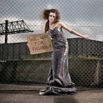
ice1redjacket1willworkforfashion1
Credit: http://www.nicolashenri.ch/#/Portfolio/

Nicolas Henri is a Swiss photographer who originally attended film school in Toronto, Canada. After working as a picture editor for a TV station in Switzerland, Henri combines his experience there with his career as a professional photographer to create a different photo style. His portfolio, as presented on his website, demonstrate clearly his passion for mostly (with exceptions) photographing people and an undeniable resemeblence to fashion journalism.

His portfolio, “The Book of Grace” is the most reserved of his collections. His other photos use colors and images to strike a certain emotional reaction using black and white photography, frightening and jarring situations or people, and different types of lighting and lenses to set up a shot. However, in “The Book of Grace” Henri tends to juxtapose his well dressed models in industrial or unusual settings. Often his pictures contain an intense expression or situation that gives off an aggressive vibe using bold colors such as red, mustard yellow or white. Also, the pictures in this collection clearly show his work experience in television. Shards of glass, water bubbles, snow or moving hair adds motion and animation interest to his photos. Henri experiments with placing his subjects in the center, the right and the left of the picture. He also makes use of depth of field by focusing on the model and blurring the background. He has no pattern of lighting in this portfolio; Henri uses both natural light and backlighting. I really like Henri’s photos and how he incorporates different angles and perspective throughout his portfolio. Henri photographs both black and white and color photos exceptionally well; proving his capablilities as an equally talented photographer in making use of color or lack there of. I think his strongest capabilities lie in his ability to take a undeniable emotionally charged picture that is interesting and unique to the viewer.

Photo Essay: Bed Side Tables

In this photo essay, I chose to illustrate the different bed side tables in different bedrooms. I took the pictures at eyelevel with natural light as the light source. I did not let the subjects touch or adjust (clean-up) their nightstands before I took the picture.

Single Photo Review

photo-review
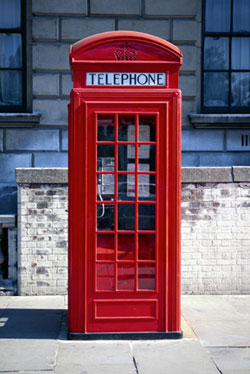
(Credit: Microsoft)

This photograph makes great use of color, lighting and positioning. The bright red of the main subject stands out against the darker background. This contrast makes the scene interesting. The rule of thirds is used in this picture because the picture is split in to three sections; the left of the phone booth, the phone booth and the right of the phone booth. The positioning of the phone booth in the center makes it obvious that it is the main focus of the shot. The phone booth is also the main focus due to the lighting. The red stands out not only due to its bright contrast but also because it is iluminated. The depth of field is interesting because the background of the phone booth, although in focus, is darker and provides a patterned background to the image. The shadow of the phone booth indicates the source of the light. Also, the photographer clearly was attempting to eliminate something after the end of the wall in the background by only including the direct sides of the phone booth.

Photo Project

low-angle-photo-project-041

Low Angle
In order to get to my bedroom, you have to go up a flight of stairs that is overlooked by a landing. I experimented by draping various items over the railing and standing on the stairs below and taking the picture. I aimed a fluorescent light at the scene. I chose different items with complimenting color schemes but with exciting patterns. I wanted this photo to resemble a fashion journalism spread or perhaps an advertisement for a brand of shoes. I decided to place the shoes off center to add interest to the picture; this is something I have often seen in high fashion advertisements. I have styled for photo shoots in fashion journlism but never actually taken the shots; this presented problems because what photos I was creating was not the same professionally taken picture I had in my head. However, I think that adding background patterns did present the image I wanted to portray.